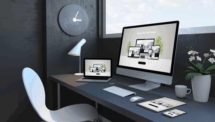
In today's world, more and more people are accessing the internet through various devices, including smartphones, tablets, laptops, and desktop computers. As a result, websites must be designed to work seamlessly on all types of devices, regardless of screen size. This is where responsive design comes in.
Responsive design is a web design approach that ensures a website adjusts its layout and content to fit the size of the device it's being viewed on. This means that regardless of whether someone is accessing your website on a smartphone or desktop, they will have a positive user experience and easily find the information they're looking for.
Here are some of the critical benefits of having a responsive website:
To achieve a responsive design, web designers use a combination of HTML, CSS, and JavaScript. These technologies work together to create a website that adapts to the size of the device it's being viewed on.
HTML provides the structure and content of the website, while CSS is used to style the website and determine how it looks. JavaScript provides interactivity and dynamic behavior for the website, such as drop-down menus, sliding images, and other interactive elements.
The design of a responsive website is based on a grid system. A grid system is a framework made up of rows and columns that determine the website's layout. The grid system is flexible, which means it can adjust to different screen sizes and resolutions, ensuring that the website looks great on all devices.
When a website is viewed on a smaller device, such as a smartphone, the grid system automatically adjusts the layout of the website so that the content is displayed in a way that is optimized for the smaller screen size. This ensures that the website is easy to use and navigate on smaller devices..
Here are some of the critical elements of a responsive design:
In conclusion, responsive design is a critical aspect of modern web design that can significantly benefit businesses in terms of improved user experience, increased traffic, better search engine optimization, cost-effectiveness, and improved accessibility. If you're looking to take your website to the next level and ensure it works seamlessly on all devices, then the team at Web Studio Florida is here to help.
Contact us today and see the difference that a responsive website can make for your business.
Schedule a Consultation
or
Drop a Message
We look forward to working with you and helping you achieve your web design goals!